The Popup Builder allows you to create interactive modal windows and overlays for your site. While the initial setup is similar to the Header and Footer, the Popup Builder features exclusive design controls within the Elementor editor to manage dimensions, positions, and animations.
Create the Popup Template #
Initialize your popup within the Theme Helper library before moving to the visual design:
- Access: Navigate to Digishift Studio > Theme Helper.
- Add New: Click Add New Template and enter a title (e.g., “Newsletter Popup”).
- Set Type: Select Popup from the Template Type dropdown.
- Attributes: Set the Post Attributes template to Elementor Canvas in the right sidebar.
- Publish: You must click Publish to save these settings before the specific Popup controls will be available in the editor.
Configure Display & Exclusion Rules #
Determine when and where your popup should appear:
- Display Rules: Assign the popup to the Entire Site or specific categories/pages.
- Exclusion Rules: Prevent the popup from appearing on critical pages like “Checkout” or “Contact”.
Elementor Popup Settings #
Once you click Edit with Elementor, a unique Popup Settings panel will be available in the bottom-left settings icon (gear icon).
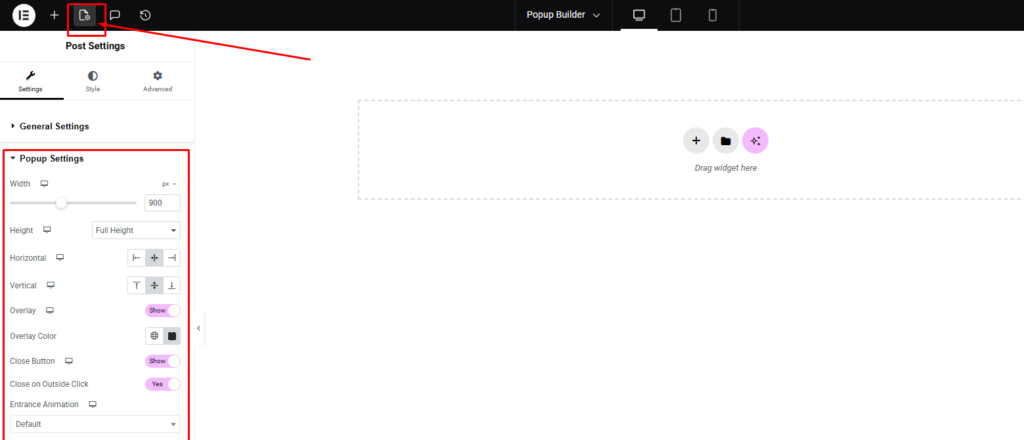
Layout & Dimensions #
- Width: Set the specific width of the popup in pixels.
- Height: Choose from three distinct height behaviors:
- Fit to Screen (Default): Automatically scales the popup to fit the user’s viewport.
- Full Height: Stretches the popup from the top to the bottom of the screen.
- Custom Height: Allows you to define a specific pixel height (e.g., 400px).
Positioning #
Use the Horizontal and Vertical alignment tools to anchor the popup to the center, top, bottom, or corners of the screen.
Overlay & Close Controls #
- Overlay: Toggle Show/Hide to control the background dimming effect behind the popup.
- Overlay Color: Set a specific color for the overlay that will be shown under the pop-up.
- Close Button: Enable the Close Button and configure its size and position (Top Offset/Side Offset) to ensure users can easily dismiss the popup.
- Close on Outside Click: Set to Yes to allow users to exit the popup by clicking anywhere on the background overlay.
Animations #
You can apply standard Elementor animations to control how the popup enters and exits the screen:
- Entrance Animation: Select effects like Fade In, Zoom In, or Slide In.
- Exit Animation: Choose how the popup disappears when closed.
- Duration & Delay: Fine-tune the speed (Animation Duration) and the timing (Animation Delay) of these effects.